Purpose
This functional specification establishes the need for a human-computer interaction (HCI) dataset and algorithm to translate visual error syntax into screen-reader friendly labels which can provide people who are blind with the critical
information needed to successfully complete forms on the web. In addition to justifying the dataset creation, this document proposes a method and guidelines for creating said dataset.
Problem Description
After a six-month study consisting of a survey of screen reader users as well as interviews with accessibility experts and people who are blind, the Olin College SCOPE team sponsored by Microsoft discovered that completing web forms often
presents disproportionate difficulty for screen reader users. This is because visually impaired or blind screen reader users have limited access to the visual cues that sighted users can pick up on.
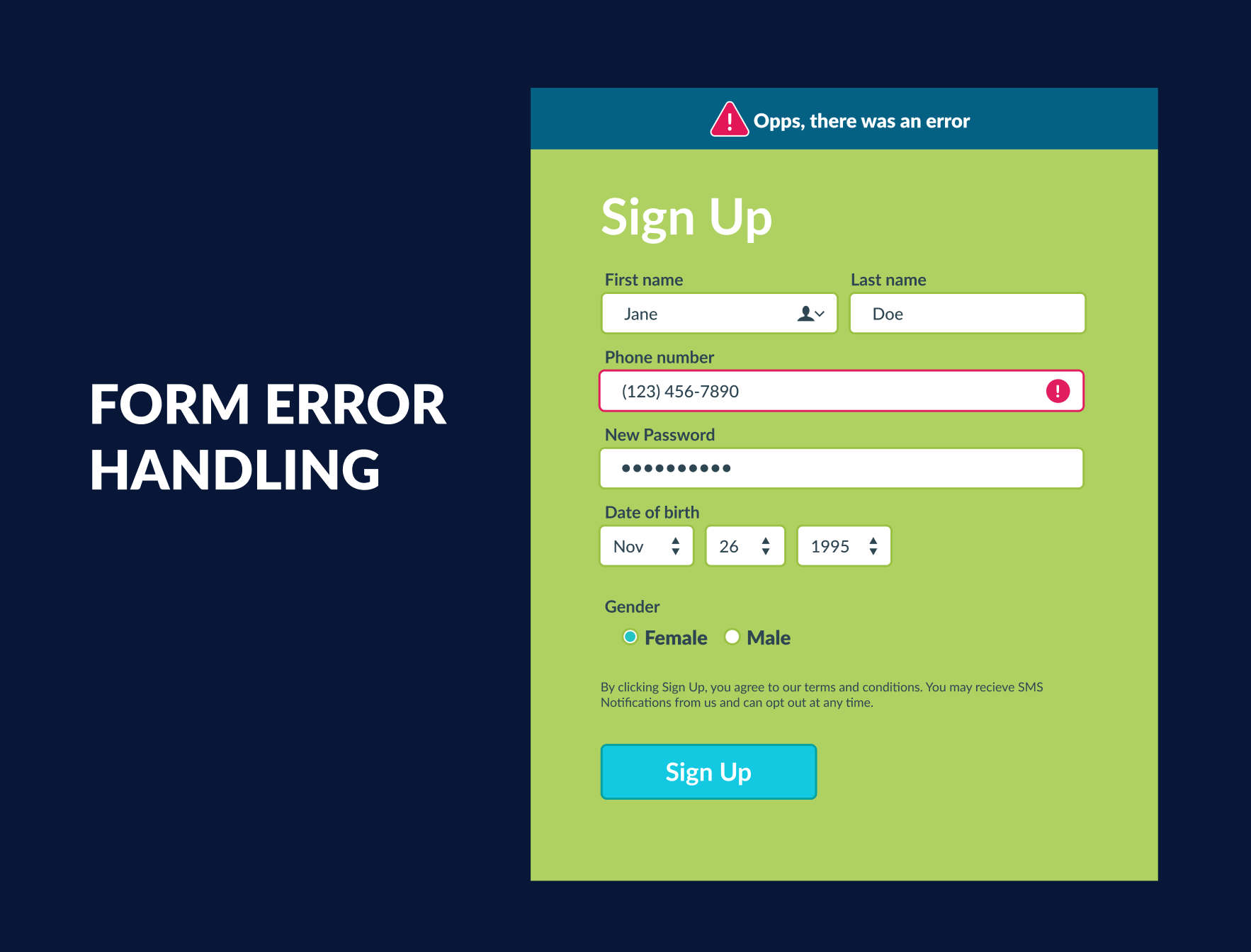
Consider the following example of an ecommerce checkout form:
A user enters the shipping address with an un-supported format and submits their order only to receive a message that the form contains an error
[1]
The success of the error recovery and form’s completion relies on the ability of the error message to 1) draw the user’s focus to the message, 2) communicate that an error exists and 3) communicate what that error is and/or how to resolve
it. Each of these key elements of an error message routinely relies on visual cues.
If the user in our imagined checkout process is sighted, they might first notice a banner appear at the top of the form as a result of an attempted submission. This banner alert or the form field in question might change to a red color to indicate
that the field is in an error state, and a text message might state why the field is in error. With this information, our sighted user resolves the error and submits their form with minimal difficulty.
If, however, our imagined user is blind and using a screen reader, they may not notice the appearance of an alert unless the site is coded to draw a screen reader’s focus to the error message. They will also not observe the color change of the
form and, depending on the site’s coding, may not receive any indication that their form failed to submit due to an error. The user would then need to intuit that there is an error and search the form for the written message indicating why.
Upon finding the error message at the top of the form and learning that the shipping address contains a formatting error, the screen reader user must then navigate back down through the form to the shipping address and again deduce which of the
street address, city, state, country and zip code fields contains the format error. Only then can they resolve the problem and move forward with their task.
This example illustrates the potential difficulty that screen reader users face when they must troubleshoot a form without access to the visual syntax communicated by an inaccessible error message.
User Scenarios
In the broadest sense, a web form can be defined as a combination of input fields and a submit action. You have likely encountered this as a payment form, a shipping form, a login form, a customer support request, an application form –
the list goes on. Each of these form types can present errors which have significant impacts on the people who use them.
Through interviews and survey responses from screen reader users, we have heard of many ways in which users experience web form errors and how those errors impact their lives. In this section, we will account for some such scenarios based on
the specific stories we heard from screen reader users. These stories use pseudonyms to protect our interviewees’ identities.
Scenario 1: Ecommerce
One of the most consistent themes we heard throughout our research was the importance of online shopping for people who are blind (see our whitepaper on HCD results for more). With many barriers in the physical world precluding people who are
blind from easily acquiring food, medicines and other goods, many of our interviewees expressed that they would prefer to shop online – if it were made accessible to them.
One such survey respondent, Maria, went further to describe how she adapts to accessibility issues when shopping online. She explains,
"Even though earlier steps can also be inaccessible, I can find work-arounds. For instance, reading reviews and comparing products on other more accessible websites before going to a shopping website with a product already in mind. It's the check-out
inaccessibility that I really can't avoid."
In this case, Maria has developed a strategy for circumventing the accessibility failures of Amazon product pages by learning product information from sites that are easier to search and browse. While this trick helps her move past some
accessibility blockers, others, particularly during the form-heavy checkout process, cannot be avoided as they are essential to the task at hand.
As often as we heard about the importance of online shopping, we heard that users would prefer to have task-blocking accessibility issues tackled before frequent minor issues. Therefore, forms involved in the checkout process of ecommerce sites
rest at a critical junction of importance for screen reader users.
Scenario 2: Travel Booking
Shortly behind ecommerce, we identified travel booking sites as another critical category of online activity. For example, during one of our interviews, a blind web user indicated that blockers prohibiting them from buying a ticket to fly home
or participating in key life events were more devastating than blockers on other site types. When flights or international travel are involved, high costs and unfamiliar travel regulations can put additional pressure on the user to ensure the booking
process is error-free, making errors with accessibility blockers more upsetting when they occur and cannot be resolved.
One of our survey respondents, Linda, is a travel advisor who often booked flights for clients. She described a common issue on booking engines:
"I've noticed that in some cases, typing in a date or number of passengers or rooms doesn't necessarily remove whatever is there by default. This can result in unnecessary errors. For example, I think I've typed in 3 passengers, not knowing
that the default number is 2, making the total number of passengers listed as 23. With dates, I might type 03/13/2021, not realizing that the default date of 02/08/2021 was the default, resulting in an error message asking me to type in a valid
date."
Linda describes a common form usability flaw that leads to a high error rate. While Linda described a situation that she could easily resolve with the notice of an invalid date, she also recounted her frustrations when such error recovery is
not possible:
"Sometimes I've had to start over from scratch, which is time-consuming and frustrating! I want to do my research as thoroughly and quickly as possible so that my client isn't inconvenienced because of elements like this that are either
completely or somewhat inaccessible."
Since Linda’s livelihood relies on her client’s satisfaction, hiccups and delays throughout the booking process can add pressure to already frustrating usability issues. As an advanced screen reader user and professional travel
advisor, Linda’s struggles with booking forms online illustrate that for a low confidence screen reader user attempting a one-time airfare purchase, such a minor usability flaw as sample text in a field can be a complete blocker to one’s
success.
As with ecommerce, travel booking sites require the use of web forms, both during initial searches for hotels, flights or trains as well as during checkout processes. This reinforces our belief that improving the accessibility of web form error
handling would improve many types of critical web activity for web users who are blind.
Scenario 3: Job Applications
Given the high rate of unemployment for people who are blind in the United States, job application sites were also described as one of the more critical website types during our interviews. Whether on aggregate sites like Indeed.com or on
individual job posting pages, job applications represent another instance of web forms being prone to errors.
Another survey respondent, Alex, is a job placement counselor with low vision who said:
"The process of applying for jobs is the most inaccessible. There can be errors in formatting that are not clear and do not allow you to proceed… really the process can be a complete barrier to employment"
Though an ambiguous error message may seem innocent enough, if you cannot observe the formatting discrepancy, recovery is much more challenging and can completely disrupt one’s task. If that task is as essential as a job application form,
usability flaws as seemingly inconsequential as a date picker widget which does not support text entry or a drag-and-drop widget which requires mouse use can mean an applicant is unable to set times they are available to interview or unable to upload
a resume to the application. While this project would not be able to address the usability flaws directly, we hope that a dataset which identifies visual cues in error messaging will both provide assistance to screen reader users recovering from
errors resulting from such flaws and raise awareness about the critical importance usability plays in accessibility.
Together with ecommerce and travel, job application forms paint a picture of the many web form types that exist. Each of these use cases illustrate real life consequences of unresolvable form accessibility errors. These scenarios describe just
some of the many ways in which users have dealt with forms on each site type, establishing a dire need for an improved generalized system that communicates web form errors to people who are blind.
Competitive Landscape
Discussion
Based on our preliminary findings, more research into web form design and error handling has been done in industry than in academic contexts. Of the two academic studies we found, one is eight years old and the other over twenty. From industry,
many sources detail how to design and code web forms that reduce error rates altogether, primarily with sighted users in mind (though there are also some sources written particularly with accessibility in mind). While an ultimate reduction in error
rates is an admirable goal, as Neilson’s usability heuristics describe, errors are inevitable (Neilson). Thus, we want this project to assume that errors will occur and design for quick and minimally obstructive error recovery instead of on
designing to eliminate errors altogether.
In the literature on error recovery messages, we found many articles on writing successful error messages which paint a clear picture of what good usability (and in many cases good accessibility) looks like in an error message. We were unable
to find an existing categorization of error message types beyond the distinction between browser error types (ie.
404: page not found
) and website error types (ie. a form input formatting error) and web application error types (ie. a syncing error in Microsoft Sharepoint’s online word editor). While there are many existing publications on writing successful error
messages, we have found no evidence that other work is being done to retroactively improve the accessibility of an already-published website by translating the existing visual error message syntax to usable screen reader dialog using human-computer
interaction tools.
Sources
-
Avila, Jonathan. “
How to Provide Accessible Form Error Identification.
” Level Access, 2014,
https://www.levelaccess.com/level-access-news/how-to-provide-accessible-error-identification/
.
-
Drawing heavily on WCAG success criteria for errors, this article describes the difference between after-submit form validation and dynamic form validation as well as highlights best practices for creating accessible error messages for each.
-
This site would be extremely helpful for informing what the target output of the dataset should be for each error message type as it is informed by WCAG standards and has accessibility in mind.
-
Birkett, Alex. “
Error Messages: Examples, Best Practices & Common Mistakes
.” CXL. Last modified July 23, 2019. Accessed March 24, 2021.
https://cxl.com/blog/error-messages/
.
-
Describes common error message types and good practices for creating usable web error messages.
-
Brodbeck, Felix, Dieter Zapf, Jochen Prumper, and Michael Frese. “
Error Handling in Office Work with Computers: A Field Study.
” Journal of Occupational and Organizational Psychology 66, no. 4 (December 1993): 303+. Accessed March 25, 2021.
https://link.gale.com/apps/doc/A14894825/AONE?u=mlin_m_fwolin&sid=AONE&xid=dedaf2db
-
The web has certainly developed significantly since this study’s publication (1995); however, it does a wonderful job explaining what an error is and demonstrating how much time the participants spend on resolving errors when operating
day to day tasks.
-
Fessenden, Therese. “
Modal & Nonmodal Dialogs: When (& When Not) to Use Them.
” Nielsen Norman Group. Last modified April 23, 2017. Accessed March 24, 2021.
https://www.nngroup.com/articles/modal-nonmodal-dialog/
.
-
This article describes two common methods of error messaging along with examples of what they look like.
-
Francis, H., D. Al-Jumeily, and T. O. Lund. “
A Framework to Support E-Commerce Development for People with Visual Impairment.
” In 2013 Sixth International Conference on Developments in ESystems Engineering, 335–341, 2013.
-
This article lays out guidelines for making online shopping accessible divided among the primary tasks of the shopping process. Beginning on page 6, they outline guidelines for the shopping cart and checkout steps. These include two mentions of
forms but the suggestions do not seem particularly helpful for people who are blind. Guideline 5.3 suggests to “Highlight required form fields” using border colors and asterisks. They also suggest “highlighting incorrect or missing
form fields … a red border color is often used to highlight a missing required field as the color red is associated with an error or wrong doing”.
-
While this provides excellent visual feedback to a sighted user, the guidelines do not provide any suggestions on making this feedback accessible via screen reader. In Guideline 5.6, developers should “display help and tool tips for form
fields” which they suggest using to indicate submission errors, as well as provide detailed instructions. However, they disregard that most blind screen reader users do not use a mouse to navigate and the instruction on making tool tips appear
“if a user places a mouse cursor over the title of the required field” becomes irrelevant when designing for blind web users.
-
These guidelines are definitely on to something, but indicate the need for additional work to be done to translate the predominately visual error feedback into useful screen reader audio feedback.
-
Gustafson, Aaron. “
Conversational Semantics for the Web
” Presented at the CascadiaJS, Seattle WA, USA, November 2018. Accessed March 26, 2021.
https://noti.st/aarongustafson/YH1XLl/conversational-semantics-for-the-web
.
-
Through our Microsoft liaisons we were able to speak with Aaron who shared with us this presentation and recommended exploring its references for further research. They have not yet been explored but would be worth examination.
-
———. “
The Features of Highly Effective Forms
” Presented at the Smashing Conference, New York, NY, June 2016. Accessed March 26, 2021.
https://noti.st/aarongustafson/EhL5Kj/the-features-of-highly-effective-forms
.
-
Through our Microsoft liaisons we were able to speak with Aaron who shared with us this presentation which describes ideal code syntax and design elements for creating accessible web forms.
-
Krause, Rachel. “
How to Report Errors in Forms: 10 Design Guidelines.
” Nielsen Norman Group. Last modified February 3, 2019. Accessed March 25, 2021.
https://www.nngroup.com/articles/errors-forms-design-guidelines/
.
-
Abundant documentation exists for improving the accessibility of web form errors. These often discuss the ways (good and bad) that forms currently indicate errors and may be helpful when designing and deciding on labels and edge cases to
include in the initial dataset design. The articles do not however often consider the experience of blind web users.
-
Laubheimer, Page. “
Preventing User Errors: Avoiding Conscious Mistakes
.” Nielsen Norman Group. Last modified September 7, 2015. Accessed March 24, 2021.
https://www.nngroup.com/articles/user-mistakes/
.
-
Describes web form error prevention methods including error prevention notification.
-
———. “
Preventing User Errors: Avoiding Unconscious Slips.
” Neilsen Norman Group. Last modified August 23, 2015. Accessed March 24, 2021.
https://www.nngroup.com/articles/slips/
.
-
Describes web form error prevention methods including error prevention notification.
-
Nielsen, Jakob. “
10 Usability Heuristics for User Interface Design
.” Nielsen Norman Group. Last modified April 24, 1994. Accessed March 24, 2021.
https://www.nngroup.com/articles/ten-usability-heuristics/#poster
.
-
This article describes the usability heuristics and can be helpful for determining how improved error messaging may be useful for users.
-
“
User Notifications.
” W3, W3C, 27 July 2019,
https://www.w3.org/WAI/tutorials/forms/notifications/
.
-
This article provides examples with code snippets for both dynamic and after-submit error messaging. It is a W3C tutorial, so the samples include aria fields and best practices and should therefore be used to identify ideal outputs of the algorithm.
-
Walden, Alison. “
Accessible Form Validation.
” Medium, 8 Feb. 2018,
https://lsnrae.medium.com/accessible-form-validation-9fa637ddb0fc
.
-
This article lists common accessibility issues in web form creation that describes common form issue #5 as “Form validation that is not accessible”. This is the primary target of this proposal and therefore, this section could be
helpful to this project. It discusses dynamic and after-submit error messaging and error messaging best practices and how focus should shift as a result of an error message.
-
“
WebAIM: Usable and Accessible Form Validation and Error Recovery.
” WebAIM, Center for Persons with Disabilities, 13 Jan. 2021,
https://webaim.org/techniques/formvalidation/
.
-
This article provides an introduction to web form errors and error recovery messages. It provides code snippets to describe the appropriate aria labels and discusses the approaches to providing error recovery messages. This article is written
primarily for developers but the guidelines and samples for successful error recovery messages ought to be considered.
-
Wiyono, Briansyah Setio, and Siti Rochimah. “
Error Message Quality of Web Form: Assessment on Existing Parameters.
” Yogyakarta, Indonesia: IEEE, 2018.
https://eds-a-ebscohost-com.olin.idm.oclc.org/eds/detail/detail?vid=4&sid=3d6ab998-5aeb-428f-9cef-a29210745be6%40sdc-v-sessmgr02&bdata=JnNpdGU9ZWRzLWxpdmU%3d#AN=edseee.8864256&db=edseee
.
-
Paper evaluating the quality of error messages and advocating for improved design guidelines for error messaging of web forms.
-
Zalazar, Kim. “
Indicators, Validations, and Notifications: Pick the Correct Communication Option.
” Nielsen Norman Group. Last modified July 26, 2015. Accessed March 24, 2021.
https://www.nngroup.com/articles/indicators-validations-notifications/
.
-
This article describes the types of user messaging including validation (which contains error messaging).
Definition of Scope
In order to discuss the appropriate scope for this project, it is helpful to establish a shared vocabulary for system status communication first. Below, we have provided a list of helpful terms with their definitions alongside a flowchart which
visually demonstrates how they are connected. Please note that these definitions are paraphrased from the Zalazar and Laubheimer sources listed above.

-
System Status Communication:
any feedback which informs the user about the current context of the system. Can be categorized as an indicator, notification, or validation.
-
Indicators:
passive (does not require action) feedback related to a specific element on the page which can be triggered by either user action or a system event.
-
Notifications:
following a system event, a notification can be either passive or require user action and they can refer to the page at large or a particular page element.
-
Validations:
in response to user action, validations are context specific and often require user action. Validation messages primarily focus on error handling.
-
Error Prevention:
are any user facing feedback message that informs the user about an impending error state or suggestions for avoiding an error state.
-
Error Correction:
are
any
user facing feedback messages which respond to a user action with a notice that the system is in an error state. Error correction messages on the web can be further categorized as browser errors and website errors (previously defined in the
Competitive Landscape Discussion
subsection).
In determining the appropriate scope for this project, we considered everything from the broadest system status communication level tool to the most specific website form error level. We have determined that a machine learning tool which
improves web usability for people who are blind needs to only focus on website error correction messages. Notifications are explored further in another functional specification for pop-ups and system status communication was determined to be too
broad of a project, since it encapsulates everything below. User needs demonstrate considerably more concern for validation messages than indicators, encouraging us to down-scope to only error handling related messages.
In analyzing the literature on error correction versus error prevention, we deemed error prevention a poor match for a retroactive computer vision solution, as it would be much more thoroughly and accurately addressed with usability design
improvements. This left us with the two error correction categories: browser level error correction and website level error correction. While far more literature exists on browser error messaging, users indicated that they experience more blocking
issues with website-level error messaging. We therefore encourage limiting this project scope to improving the usability of website level error messaging for screen reader users.
Within website level error messaging, there exists many reasons for encountering error messages. Everything from page level errors within web apps such as a syncing error that requires a page refresh to element specific bugs such as a failed
add to cart button press can result in an error message. While these could potentially be reasonable expansions of this project, we suggest focusing the dataset development on improving web form errors. As mentioned in the Use Cases section, we
define a web form as a combination of input fields and a submit action. We feel certain that this level of focus will ensure a meaningful improvement for people who are blind and be an appropriately scoped problem to solve using existing
technology.
Solution Overview
Desired Output
Our primary hope is that a machine learning algorithm could locate and draw the screen reader focus to an error message when it appears on the screen. Determining whether an error exists and where it exists on a page are no small feats, so this
first set of goals may be a completely comprehensive project on its own.
If secondary stages of implementation are feasible, we heard from users than an ideal error messaging experience would be if after the submit action, the screen reader focus changes to a top-of-form error summary which communicates what errors
are present and how they ought to be resolved. In addition, each of the errors present should ideally contain a link capable of directing screen reader focus to the error in question.
Categorization
The first step in the categorization process is the triggering of the algorithm. While we anticipate further discussion on the appropriate mechanism for doing so, we believe that triggering a before and after image capture when a submit action
is taken on a form could be an approach for instigating the algorithm’s analysis.
Below we highlight the categorization process we anticipate will be used to identify whether an error message exists.
- Identify if there is a form on the screen (for yes, required 1+ form fields and submit action)
- Determine form location
- Determine if there is an error message
[2]:
- Is there an alert?
- Is there a modal or dialog?
- Is there a violation summary?
- Is there a form field error state?
- Is there assistive text?
- Is there a persistent animation?
- Is there a red form error state?
- Are there any error icons?
- Are there any tooltips?
- Identify what information the error provides and determine an appropriate secondary label
Sample Labels
Examples of what these labels would refer to can be found in
Appendix 1: Error Messaging Categorization Samples
.
Primary labels:
Secondary labels:
-
Format error
-
Missing information
-
Invalid input
-
Etc.
Websites of Interest
Nearly every website includes at least one form, so any tool that improves web forms will have a wide-reaching effect. One of the challenging aspects of this project in terms of dataset creation is that image collection must reflect the
variation of different types of websites with forms that serve different purposes. We have therefore listed below some website categories and specific examples that we heard users would most like improved first
[3]
.
- Shopping sites with shipping and payment steps (Amazon, CVS, Walgreens, Home Depot, Etsy, Walmart, Stop and Shop, Ebay, Lowe’s, Uber Eats, Sam’s Club, Sprouts, etc.)
- Travel booking sites passenger and payment steps (Southwest, Expedia, Frontier, Kayak, Delta, Amtrak)
- Job sites application page (usajobs.gov, Indeed, LinkedIn, ZipRecruiter, company-specific job listings, etc.)
- Banking sites online applications (Bank of America, US Bank, Local Credit Unions, PNC, City, Chase, Wells Fargo, First National, etc.)
See the
Appendix 2: Website Sources
section for more site types.
Risks & Assumptions
To help ensure that this project will have the desired output, outcomes, and impact specified in this specification, we have documented some key assumptions to check at each phase of the project, from dataset creation to screen reader
integration and wide-spread user adoption. The following is the beginning of a list, so the justifications and validation strategies should not necessarily be adopted without further investigation. It is crucial to track and test assumptions in order to mitigate project risks.
Assumptions concerning the dataset & algorithm creation
-
We assume that
this project will continue to be addressed by Danna Gurari’s team at the University of Texas at Austin.
-
Potential Risk: if a different team picks up this project, the implementation descriptions to follow may not match how the team decides to address the issue.
-
We assume that
form errors present a significant enough usability problem for blind screen reader users to merit solving
.
-
Justification: for those people who are blind that we interviewed and who responded to our AURC facilitated survey, this was a problem that merits solving; however, we acknowledge that these results might not be completely representative.
-
We assume that
identifying where an error message is presented (and potentially changing the screen reader focus to the error message) along with translating the visual syntax of an error message would most improve the user experience of resolving form errors
for blind screen reader users.
-
Justification: conversations with accessibility experts and blind web developers indicated that this information would be most helpful if available.
-
Validation Strategy: further interviews with people who are blind ought to be conducted in order to ensure that this is the information that would most improve the user experience.
-
We assume that
images can be captured, and labels generated without creating a security risk for those compiling the dataset as well as those using the eventual tools created with it.
-
Potential Risk: if this dataset is used to gather data about form errors involving personal information (credit card numbers, banking information, social security numbers, etc.), and the data is not altered to protect the identity and personal
assets of the user, people who are blind may be at risk of significant personal harm.
-
Validation Strategy: during dataset creation, attention
must
be paid to how personal information will be protected.
-
We assume that
the dataset will capture enough of the variety represented by web forms to identify and caption error messages with a high confidence interval.
-
Potential Risk: the data is heavily biased to serve one site or issue well at the expense of effectively resolving issues across sites or interaction problems.
-
Validation Strategy: testing throughout dataset creation to ensure adequate variety representation in the data collected.
-
We assume that
technical limitations of computer vision do not hinder the dataset’s creation or the tool’s implementation.
-
Potential risk: Given that some error messages may be coded to appear off-screen, the image collection process may be complicated if there does not exist a method by which to capture the off-screen data.
Assumptions concerning how the dataset & algorithm will be used
-
We assume that
an algorithm to provide labels to visual form error information would be further funded to develop accessibility tools.
-
Justification: Microsoft has demonstrated commitment to improving web accessibility and by funding the research for this project we trust that they and others will continue to support this project through all of its phases.
-
We assume that
this problem is not currently being investigated nor has it already been addressed by another tool or program.
-
Justification: based on our team’s preliminary research, we have not identified any existing efforts to improve the usability and accessibility of errors within web forms; however, this is not a guarantee that other groups within industry
or academia are not pursuing this topic.
-
Validation Strategy: further research into the competitive landscape ought to be conducted to ensure this project would have the opportunity to solve a substantial problem.
-
We assume that
this problem falls within the realm of technical feasibility.
-
Justification: having worked closely with the University of Texas at Austin team lead by Danna Gurari to ensure the feasibility of this project’s scope, we feel confident that Danna’s team expects this project to be actionable.
-
We assume that
if created, screen reader developers would adopt a tool which improves the error messaging of forms for their users.
-
Potential Risk: if untrue, this dataset and algorithm creation may not have as significant of an impact on web use for screen reader users.
-
Validation Strategy: screen reader development companies ought to be consulted concerning whether they would incorporate such information into their products and whether this information can be incorporated into the existing functionality of
their products.
-
We assume that
individual website developers and website development platforms would incorporate and utilize form accessibility checkers into their development process.
-
Potential Risk: if untrue, this dataset and algorithm creation may not have as significant of an impact on web use for screen reader users.
-
Validation Strategy: website development platforms ought to be encouraged to integrate this algorithm and/or tools into their services to ensure that new websites are generated with accessibility accounted for at the time of design.
Assumptions concerning the effect of widespread use of the dataset, algorithm & any subsequent tools
-
We assume that
there is a way to incorporate information about form error messages gathered visual data into the flow of dialogue for screen reader users without creating usability concerns.
-
Potential Risk 1: if tools are created using this algorithm without significant usability testing, it could create barriers for users instead of benefits.
-
Potential Risk 2: if after submit validation messages and in-line validation messages are treated as the same without first conducting interviews to determine how users would like them to be addressed, confusion about the messages provided
could create more usability concerns than existed before the tool’s introduction.
-
Validation Strategy: User research studies ought to be conducted to ensure that the increase of information about the state does not worsen the experience for users by adding to the cognitive clutter of web interface navigation.
-
We assume that
the existence of accessibility checkers would reduce the overall number of new websites created with form error accessibility issues.
-
Potential Risk: if developers do not utilize this tool to improve sites before they are published, this project may not inspire greater societal change towards a more inclusive development process.
-
We assume that
the existence of this open-source dataset will not cause harm when used by third party developers.
-
Potential Risk: captured images of semi-completed forms could include sensitive information and could create privacy risks for the dataset creators and end-users of the tool it informs.
-
Validation Strategy: during dataset design and development, time
must
be considered to how to ensure this tool would not present undue risks if manipulated with malicious intent.
Measuring Success
Since this project is a usability project at heart, the ideal method of determining success would be a comprehensive usability study and report. Metrics such as fewer form abandonment rates and less customer service calls for form error
accessibility issues could also be used to track the project’s effect, but these could be attributed to any number of circumstances. We believe the success of this project would be best quantified through a combination of contextual interviews
with users of the developed tool, usability tests with those familiar and unfamiliar with the tool, and A/B testing with and without the tool’s functionality to compare outcomes. If such a study were performed and documented in a usability
report, the document could serve to demonstrate the project success if a marked usability increase is observed.
Appendix 1. Error Messaging Categorization Samples
Modals or Dialogs

Validation Summary

Assistive Text

Animations


Red Error State

Error Icons

Tooltips

Appendix 2. Website Sources
ECOMMERCE
Multipurpose
-
Amazon
-
Walmart
-
Target
-
Sam’s club
-
Costco
Food Delivery
Source:
Which company is winning the restaurant food delivery war?
-
Uber Eats
-
Doordash
-
Grubhub
-
Postmates
-
Seamless
-
Delivery.com
-
Dominos
Grocery
Sources:
Top 15 Online Grocery Shopping Stores in USA
,
10 Cheapest Grocery Delivery Services
-
Walmart Groceryse
-
Costco Same Day
-
Sears Food & Grocery
-
Amazon Pantry
-
Amazon Fresh
-
Kmart Online
-
Kroger
-
Safeway
-
ShopRite
-
Instacart
-
Peapod
-
The Fresh Market
-
FreshDirect
-
WeGoShop
-
Shipt
-
Boxed
-
Target
-
Vmartgo
-
Publix
-
Sam’s Club
-
Stop and Shop
-
Sprouts Farmers Market
-
LocalHarvest
-
ShopFoodEx.com
-
GoBio!
-
Thrive Market
-
Google Express
-
Waybuy
Pharmacy
-
Cvs
-
Walgreens
Home Improvement
-
Home depot
-
Lowe’s
-
Rona
-
Menards
-
Ace Hardware
Direct from Vendor
-
Ebay
-
Etsy
-
Facebook Marketplace
Pet supplies
-
Petco
-
PetSmart
-
Chewy
Clothing stores
Source:
https://www.similarweb.com/top-websites/united-states/category/lifestyle/fashion-and-apparel/
-
Macy’s
-
Gap
-
Shein
-
Nike
-
Nordstrom
Second hand clothing stores
-
ThredUp
-
Poshmark
Furniture and home goods
Source:
https://www.similarweb.com/top-websites/united-states/category/home-and-garden/furniture/
-
Ashley Furniture
-
American Freight
-
Crate and Barrel
-
Birch lane
-
All Modern
Book stores (that sell audio books or braille books)
-
Barnes and Nobel
Craft and Hobby stores
-
Michael’s
-
Hobby Lobby
-
AC Moore
Grooming
-
Dollar shave club
-
Lush
Sporting goods
-
Dick’s
-
Cabela’s
Specialty items
-
Organic tampons?
-
DnD dice
-
Specialty plant websites
-
Green coffee beans
TRANSPORTATION
Airlines
-
Southwest
-
Frontier
-
Delta
-
United
-
American
Booking Sites
-
Expedia
-
Kayak
-
Hipmunk
Bus/Trains
-
Amtrak
-
Eurail
EMPLOYMENT
Job Listing site
-
Indeed
-
Linkedin
-
Ziprecruiter
-
USAjobs.gov
-
Glassdoor
Websites used to complete work
-
Jira
-
Salesforce
-
Company-specific sites
Email services
-
Outlook
-
Gmail
-
iCloud
Finance and Legal
National Bank Companies
-
Bank of America
-
US Bank
-
PNC
-
City
-
Chase
-
Wells Fargo
-
First National
-
Citizens Bank
Local Banks
-
Credit Unions
Bill pay sites
-
Comcast
-
Spectrum
-
Xfinity
-
Verizon
-
T Mobile
-
AT&T
-
Electric providers specific to region
-
Water providers specific to region
-
Gas providers specific to region
Insurance sites
-
Progressive
-
Geico
-
Allstate
-
StateFarm
Sites for finding legal assistance
-
Lawyers.com
-
Law firms specific to region
Tax filing sites
-
TurboTax
-
IRS Free File
-
E-File
Town/city websites
-
Specific to town or city
EDUCATION
Learning Management Platform
-
Moodle
-
Blackboard
-
Canvas
Course Platform
Sources:
Online course platforms
-
Khan Academy
-
Codecademy
-
Udemy
-
Skillshare
-
Teachable
-
Podia
-
Thinkific
-
LearnWorlds
-
Pathwright
-
Udacity
University
Sources:
100+ College & University Websites for Design Inspiration
Scholarships
Sources:
15 Top Scholarship Websites
,
8 Best Websites to Find Scholarships
-
College Board
-
Scholarships.com
-
CareerOneStop
-
Studentscholarships.org
-
Chegg
-
Unigo
-
TuitionFundingSources.com
-
SWE.org
K-12 School websites
-
Specific to each school
SOCIAL MEDIA
-
Facebook
-
Linkedin
-
Twitter
HEALTH
Hospital websites
-
Specific to region
Dental care
-
Specific to region
Doctor’s offices
-
Primary care physicians specific to region
-
Optometrists specific to region
Gym membership sites
-
Planet Fitness
-
Gold’s Gym
-
Youfit
ENTERTAINMENT
Video content
-
Netflix
-
Youtube
Music streaming
-
Spotify
-
Pandora
-
Apple music
Ticket purchase for live entertainment
-
Ticket Master
-
SeatGeek
-
StubHub
Restaurant sites
-
Panera
-
Chipotle
-
Olive Garden
-
Small local restaurants that do not have apps
ARTICLE SITES
News Site
-
New York Times
-
CNN
-
Wall Street Journal
-
Washington Post
-
Yahoo News
-
Google News
-
Huffington Post
-
Fox News
-
NBC News
-
CNBC
-
NPR
-
Forbes
Blogs
-
Pinch of Yum
COMMUNITY FORUM SITES
-
Wikipedia
-
Reddit
-
Goodreads
-
Pinterest
COMPANY SITES
-
Apple
-
Microsoft
-
IBM
HOUSING SITES
Real Estate
-
Specific to region
For Rent/Lease
-
Zillow
-
Realtor.com
Short Term Stay
-
Hilton
-
Airbnb
-
Vrbo
GOVERNMENT SITES
-
50 Popular Government Websites
-
The Top 20 Essential US Government Websites
-
Local Government websites